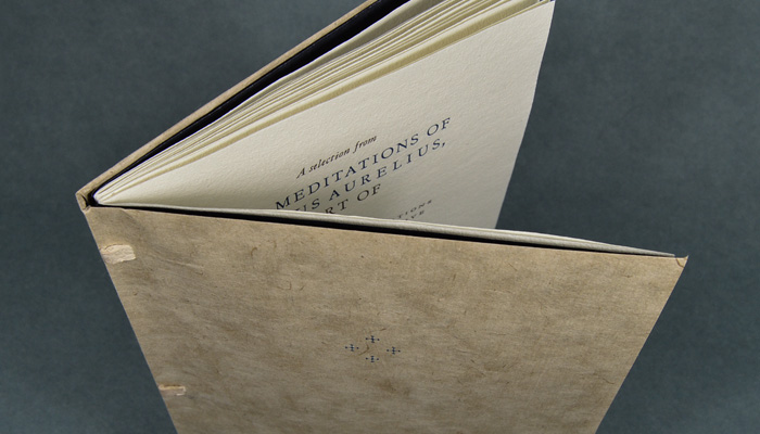
Books

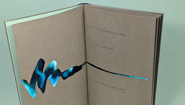
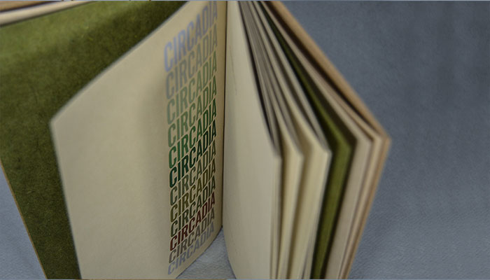
2021
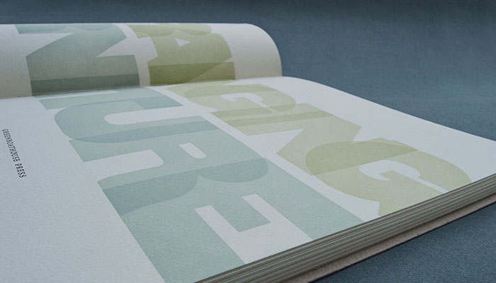
Arranging Furniture
Abstract compositions printed from wooden furniture
Jason Dewinetz & Aaron Peck
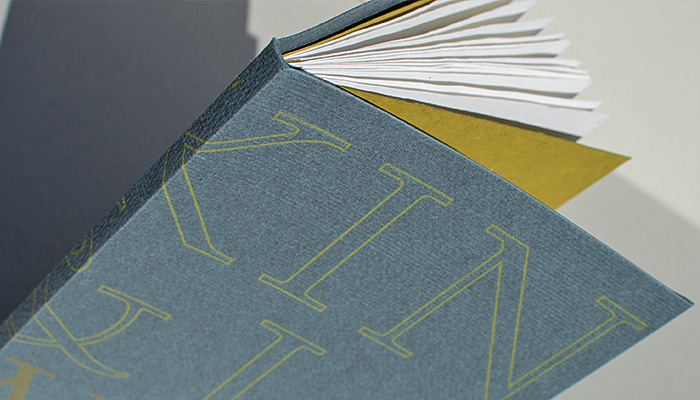
2016-17
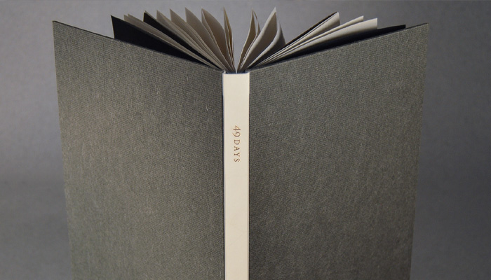
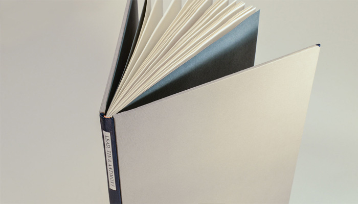
Lead, Tin & Antimony
A sampling of types held in cases or cast fresh at the Greenboathouse Press
Jason Dewinetz

2010
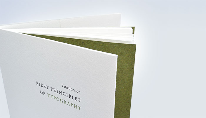
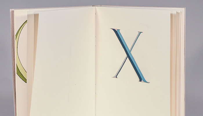
Alphabetum Romanum
The Letterforms of Felice Feliciano
With a Foreword by Paul F. Gehl and an Afterword by Jason Dewinetz.