Welcome to Greenboathouse Press
¶ Greenboathouse Press is a small Canadian publishing concern producing short run, limited editions, printed letterpress and bound by hand. As in our previous incarnation (Greenboathouse Books), our mandate is to publish work that is compelling both in its content and its form, and our attention to typography, design and fine-printing is an extension of that interest in form. ¶ Each book begins with an idea, sparked by a manuscript, which takes shape as a challenge of production: How might we do this gathering of words justice? With such words, what sort of book might be built? It is this challenge that makes our efforts exciting, often excruciating, and always rewarding.

A few copies still available...
The Turn | Like a Moth at a Window

Crispin’s poem, “The Turn,” is a captivating meditation on the memory of his mother hanging laundry, expanding out from that image, like the gust of wind the poem describes, to explore the physical, emotional, and linguistic implications of the remembered scene. The essay, in turn, teases out those implications, presenting a ruminative and fascinating exploration of the poem’s creation.
2023
If the Winds Come
“Jason Dewinetz’s new poems in If the Winds Come, with their passion and gentleness, their explosive, tactile, reflective imagery, and their insistence amid sometimes stifling fear and pain on finding humanity and lovingkindness at all costs, offer hope in the open hand.”
—Crispin Elsted
2022
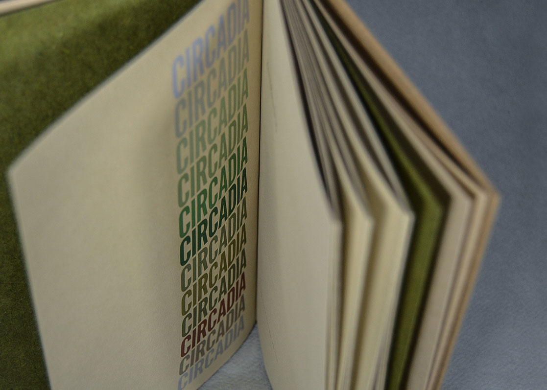
Circadia
Kevin McPherson Eckhoff's poetry sequence Circadia comprises 12 poems chronicling a year of daily observations, one line written each day. The poems, like the days, weeks and months they document, are quaint, silly, difficult, tragic and cumulatively poignant.
2020
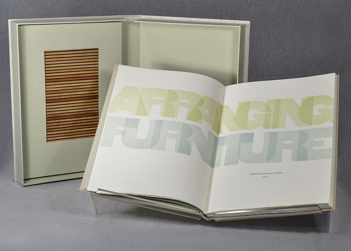
Arranging Furniture
Inspired by the colourfield paintings of Agnes Martin, Arranging Furniture presents a series of graphic compositions printed from wooden letterpress furniture. Over two dozen designs, printed in a spectrum of colours drawn from the Okanagan Valley of British Columbia, the book is both an exploration of proportion and grid, and also of the local environment and landscape. Accompanied by an essay by Aaron Peck, the book is offered in two states. More details and photos are available here, and progress photos are available on our Instagram page.
2019
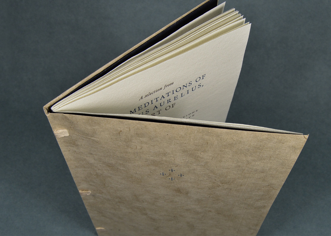
The Meditations of Marcus Aurelius, Sort Of.
Being transmogrifications of an entirely subjective cherry-picking of Book Two from the great stoic’s diary entries, in part plagiarized from various translations, partly tweaked and twisted here and there, and occasionally completely subverted where whim or purpose dictated.
View Project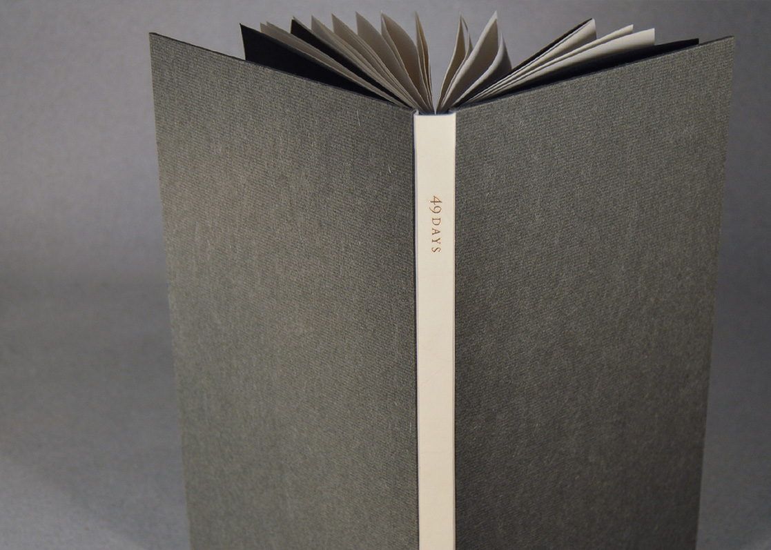
2018
49 Days by Australian poet Alan Loney.
Loney's intense and compelling long poem is an extended meditation and movement through the days and weeks immediately following the tragic death of his son. Pragmatic in tone yet poignant in purpose, this sequence slips and stumbles through the intimate yet universal maw of grief, venturing with delicate honesty to remain consciously present in the wake of loss.
View Project
2017
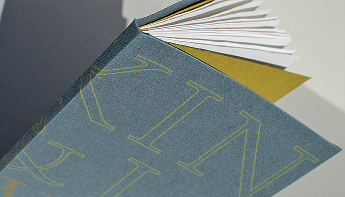
Lead, Tin & Antimony
A type specimen of sorts, LT&A presents 24 typefaces in a wide range of sizes, printed in over 25 colours. The designs include compositions of poetry, typographic quotations and extracts, short excerpts of literary prose and philosophy, as well as typographic specimens and experiments.
View Project